Read the Adobe Customer Success Case Study of the Cylance.com (PDF) redesign.
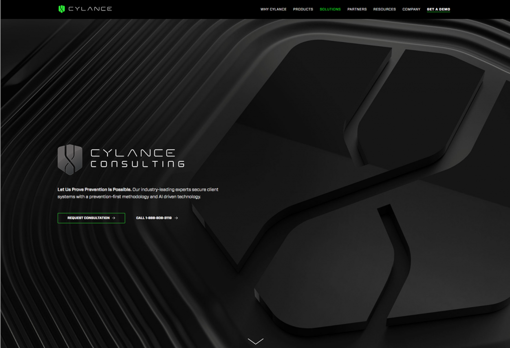
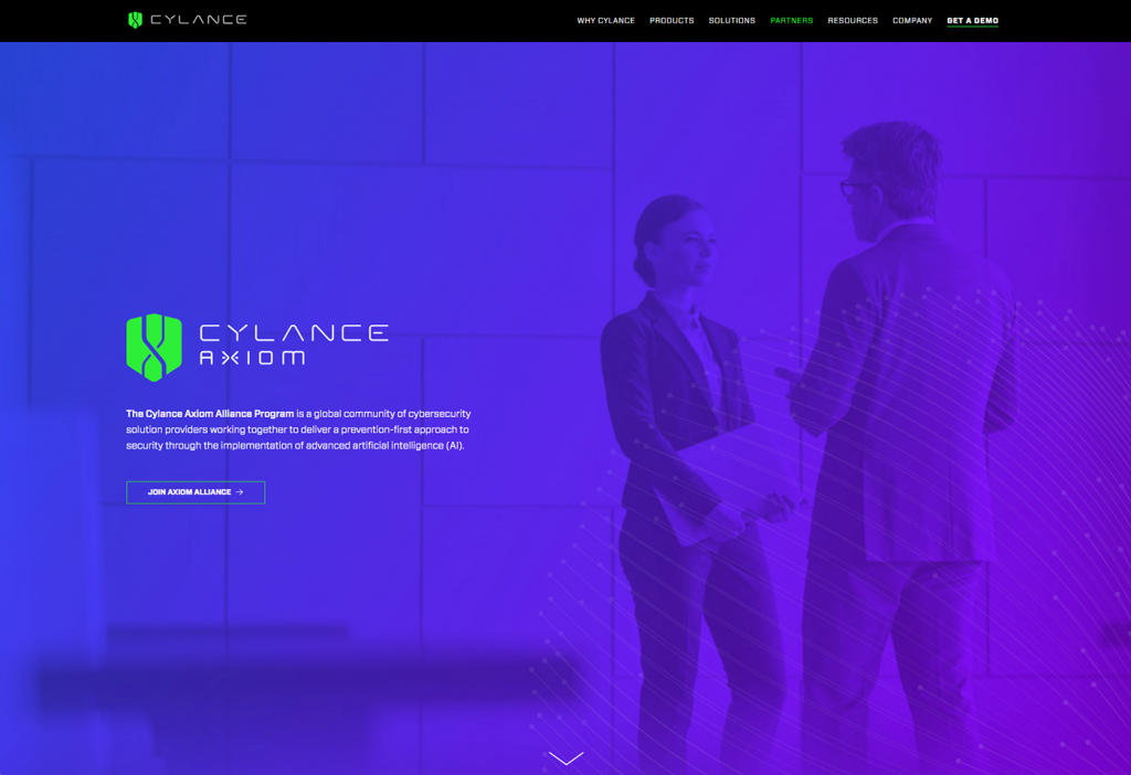
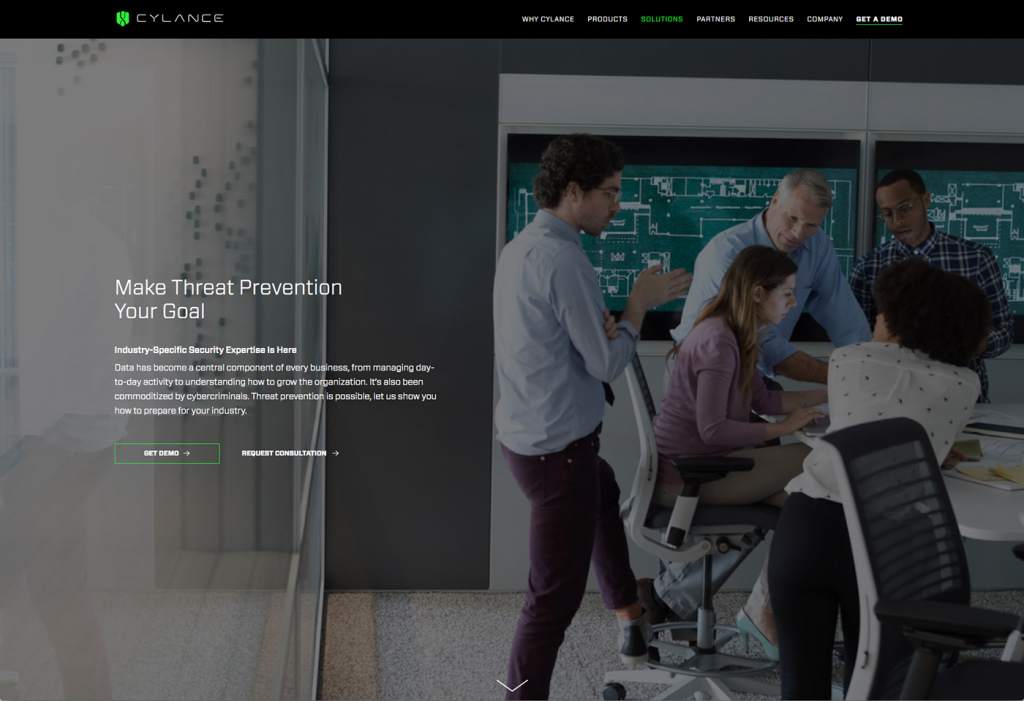
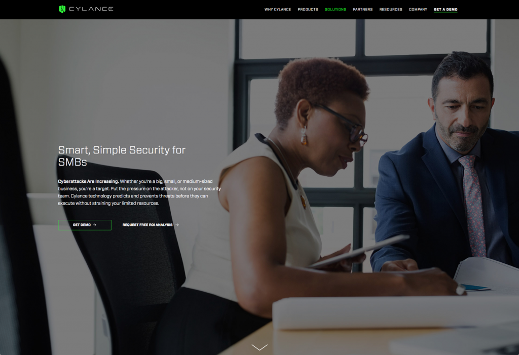
A redesign of the AI cybersecurity company’s corporate website to express their brand, initially as a late-stage startup in their 5th year of business. The legacy website was born on Hubspot and ported over to Adobe Experience Manager in the fall of 2016.
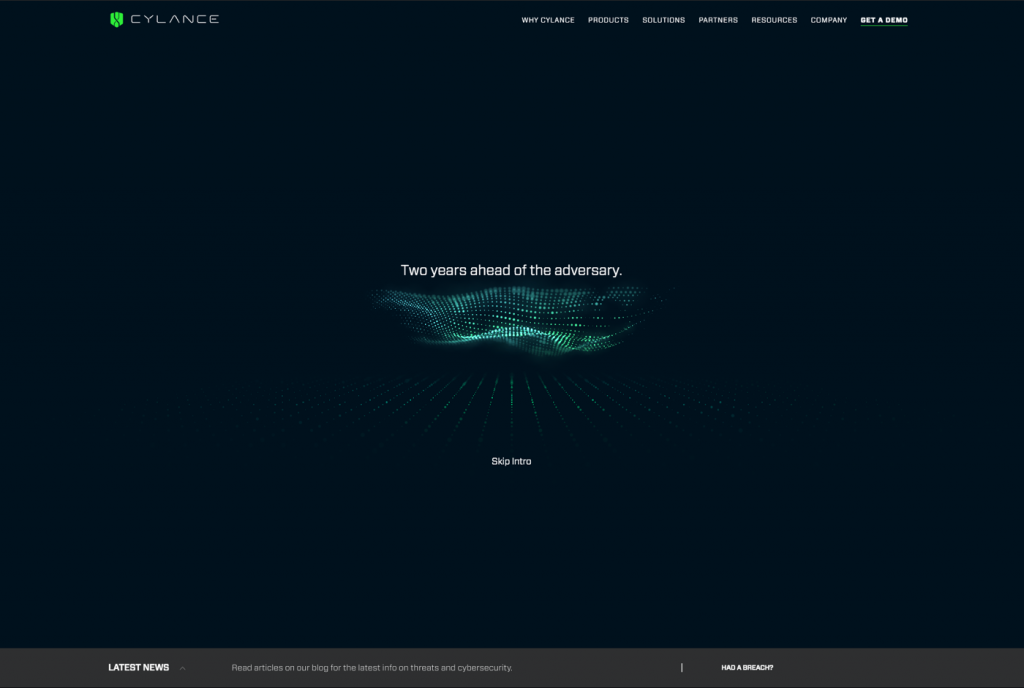
70% of the visitors to Cylance.com are arriving for the first time. A custom Web GL animation introduces the brand, and flows the user into a conversational UI that mimics a very robust chat.
Mega Menu
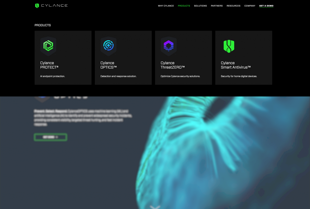
The legacy site was poorly architected and difficult to maintain. In order to match the maturity of the brand, a redesign, with our newest brand style guide, and more optimized site architecture, was set in motion in the fall of 2017.
The new website was architected to execute a modular design system that leverages the power of AEM to reduce the custom development, and production timeline from 6 weeks to 5 days.
We reduced the production of custom pages from 6 weeks to 5 days.
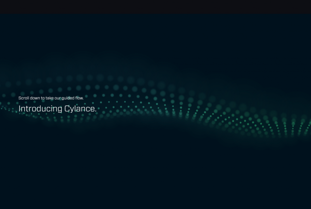
Guided Flow
Under the hood, we also enabled the Amazon LEX chat technology to pilot a “Guided Flow” to navigate content based on a pre-programmed decision tree, and bring the power of AI to the web.
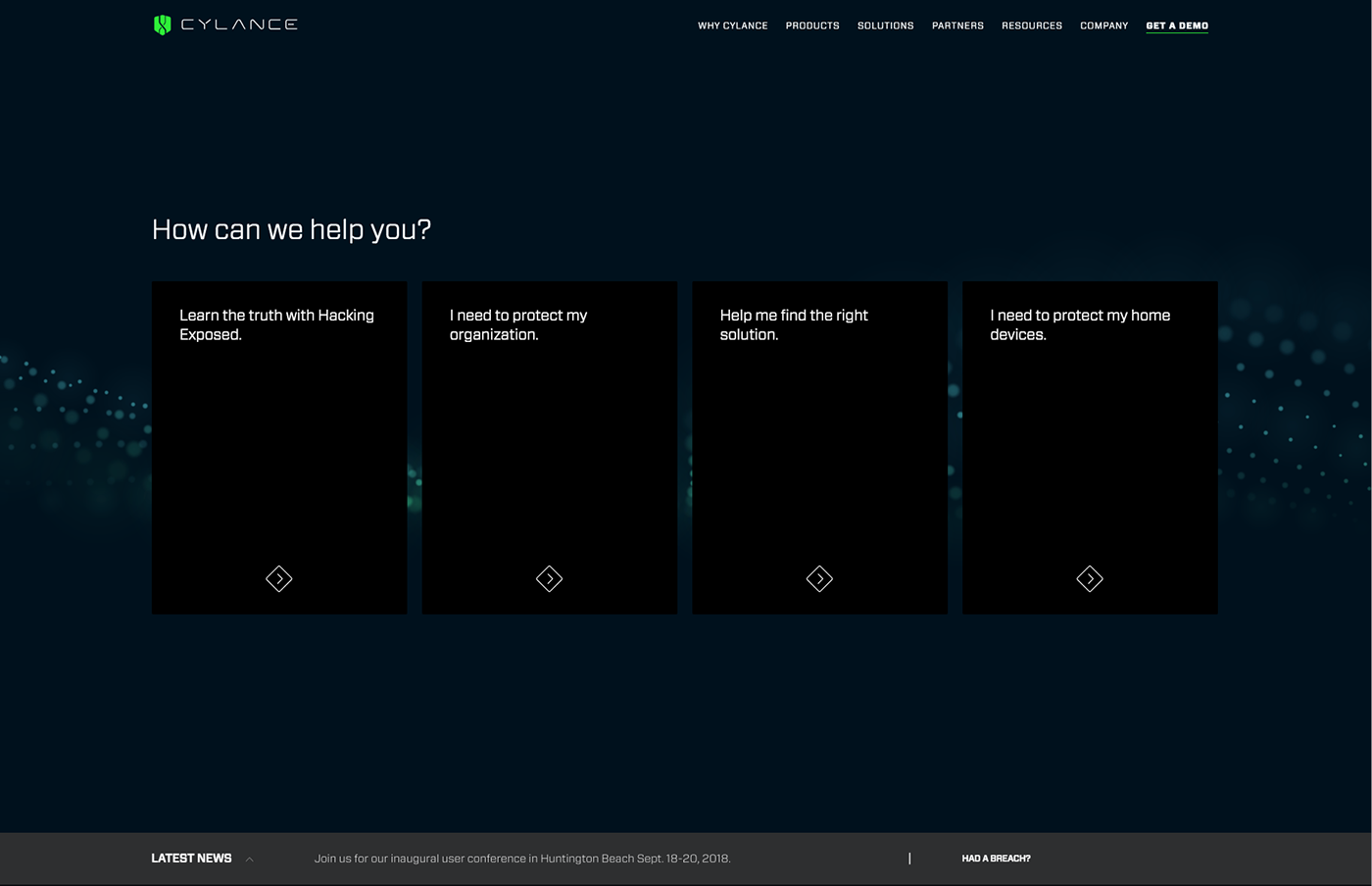
A traditional navigation will lead the user to the content they need, if they know what they are looking for from the beginning. Otherwise, we transition them into a guided flow that helps them drill down into more specific content by need, industry or scale of their business.
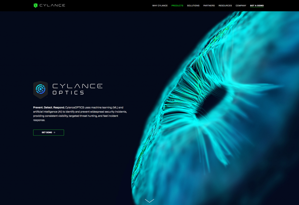
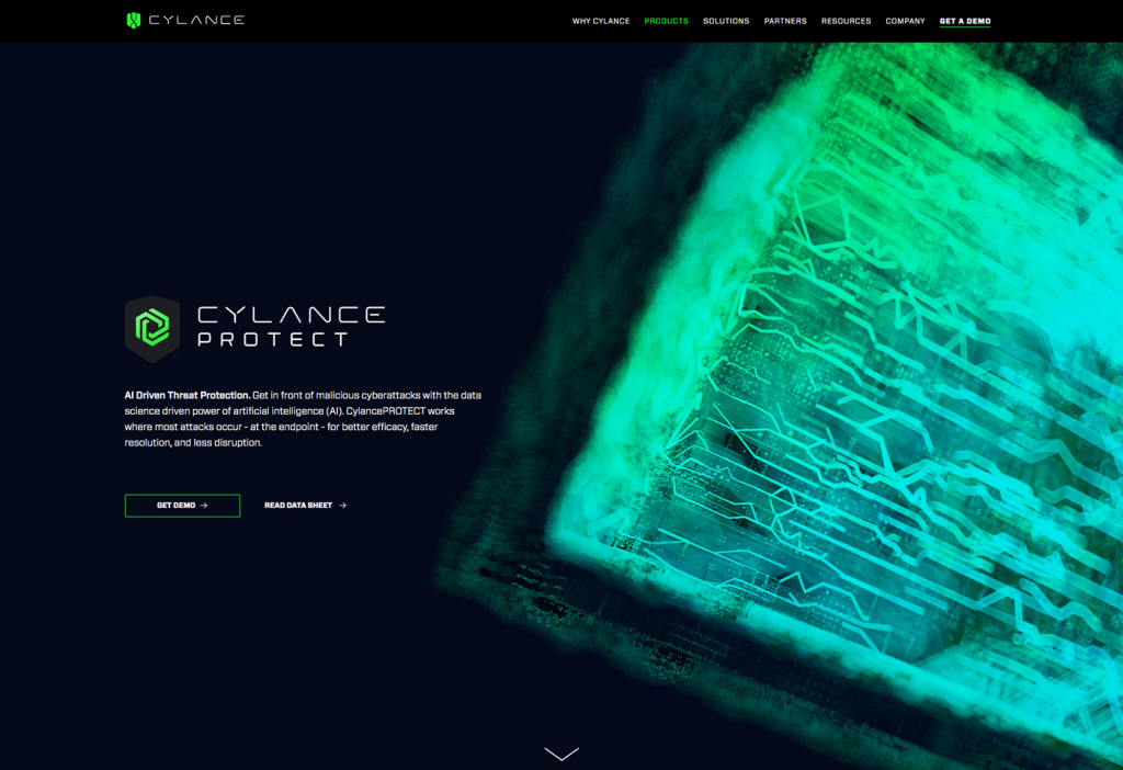
Cylance Offerings
Depending on the user’s selection, content is delivered in-line without leaving the homepage—the conversation continues as the user is guided to the best content for their interest.


